
Elite Color Printing - Pre-Press Printing FAQ's
Read our help FAQ below to learn answers and solutions to the most common problems that can occur with your design or artwork before you send it to print. This FAQ is helpful in assuring that your artwork will print the way you want it to mistake free.
If you still have questions about setting up your design or general printing questions please contact us here.
We recommend saving as a PDF with embedded fonts. We recommend this
because all the additional files you would typically need such as fonts,
graphics will be compiled into one easy to access PDF document.
We can also accept artwork files in the following types: jpeg,
psd, indt, tiff, eps, ai, doc, docx, pub, indd, gif, wps, ppt, and png
We prefer .PDF and .EPS files with embedded or outlined fonts. These file types are easier to handle and will likely help speed up your turnaround time. (If you send us a design with a font we do not have, it will be required that you send any font files as well if you want your artwork to print with the correct font, this is why we recommend PDFs with embedded fonts from the beginning so this problem does not occur.)
You should always create your files for printing with Elite Color Printing
in CMYK.
If you
choose to send us an RGB file, there is a chance that a color shift may
occur when we convert it to CMYK from RGB and you may not be satisfied
with the color on your prints. If you begin your design in CMYK you will
not have to worry about color shift. RGB can appear 25% percent brighter from the light produced by your screen.
These colors are in RGB

These are the same colors converted to CMYK

From beginning to end you should always design your artwork in CMYK color mode if you want your designs to print accurately.
We always recommend that you send us 300dpi or higher images. Most images on the web are designed at 72dpi so be sure that your images are high enough resolution before sending them. We will recommend that you find higher resolution images if they are not 300dpi.
Low resolution files sent to us may be printed as is or will be placed on hold until we receive new higher resolution files, slowing down the turnaround time of your prints.
If you submit us 72 dpi resolution images and we print it as is, your prints will end up blurry, jagged, or distorted if scaled up to 300 dpi for printing. Our printing process requires a 300 dpi resolution on all raster images for the most accurate results.

We recommend the use of our design templates to ensure the most accurate printing. We will import your design into our templates before printing so it is best to begin your design using one of our blank design templates from the start.
Bleed must extend further than the cut line to avoid white borders on your prints. Using our Design Templates can help you visualize this.
When using one of our design templates please keep all text and anything you do not want cut at least .125" away from the cut line.
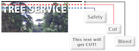
When sending an .eps or .pdf, make sure you include crop marks so we can cut the job correctly.

Yes, but if the border is too close to the cutline, it may be cut off-center slightly. We recommend avoiding the use of borders on the outter most edge of your design, they can be cut uneven or cut completely off on the final product, leaving you with an undesirable final product.
We cut through a large number of sheets at once so it is easy for their to be a slight shift in the cut leaving you with missing or uneven borders.
Any transparency issue can be resolved before saving your file.
To prevent this, never use shadows, glows, or any other transparency (image or otherwise) on top of a spot color. Always convert your spot color to CMYK and flatten before sending.
All of these effects will cause transparency problems.
When sending us your artwork and designs, do not send us extra files that we cannot print. Files such as proofs or samples, because they might get printed or cause confusion on both ends. Only send the files that you want to be printed.
We are not responsible if these kinds of files are printed. Unless you are requested to by an Elite Color Printer representative, Do Not send us files that are not being printed.
Primarily used to purposely overlap inks for a variety of reasons, overprint can cause unexpected and undesired results. We recommend that you turn off all overprint objects before sending your design files.
- On Screen View
- After Printing

In this case the design was set to overprint. The colors from logo mixed with the colors from the background image. Undesired results can occur if you have unintentionally set specific objects to overprint. Always be sure to check your logos, designs and artwork before submitting it to us.
When you are using blues in your designs make sure to leave at least a 30% color amount differential in your Cyan and Magenta percentage values.
100% Cyan, 100% Magenta, 0% Yellow, 0% K
On Screen

After Printing

Blue is very close to purple in the CMYK color spectrum. Remember to use a low amount of Magenta whenever using high amounts of cyan to avoid having your blues from printing purple.
Example: C-100 M-70 Y-0 k-0
When exporting from any program such as Indesign or Illustrator, use these settings to make sure your .PDF files export correctly.
Export settings for .PDF files
Adobe PDF Preset is set to: Press Quality
Compatibility is set to: Acrobat 4 (PDF 1.3)
Compress Text and Line Art is set to: Off
As with RGB to CMYK grayscale images that are converted to CMYK will also have a noticable color shift in the final prints. The color shift may be green or yellow, to avoid this always save your designs in CMYK even if it is black and white, we will still print it with a CMYK color process.
Also always be sure to check the CMYK values of your black and white design in the final CMYK document. If there are other color values besides K in your black and white art there is a chance that the color will vary.
To eliminate all the other color values besides K, use the Channel Mixer in Photoshop, then click "Monochrome" to adjust accordingly..
Rich black is an ink mixture of solid black, 100% K, with additional CMY ink to darken the black. This results in a much darker tone than just black ink. If you print black alone as 100% K, the blacks may not be as dark as you desire. Avoid using rich black on thinner lines and fonts because it can cause a halo effect if the colors are aligned 1 pixel off.
Rich Black

100%
K after print

We recommend using these values to achieve a nice rich black.
C60 M60 Y60 K100
These values will give you the deep, dark, rich black you want on your
blacks.
A variety of things can cause banding. Color banding can be caused by the program that the file is exported from, such as Indesign or Corel. it also, can be caused by too many gradient steps. For example if you are going from a very light color to a dark color, in a limited area this can cause color banding.
A picture of color banding.

To prevent this, check your design files for banding before sending them. If you use a gradient, make sure it has enough space for a smooth gradual transition.
Our Design Templates are a great tool for creating artwork that can be printed faster, easier, and correctly. If you are using Illustrator or Photoshop, you can use our specialized EPS templates. If you are using something else download the JPG version.
Begin by downloading the correct size template for your design, and the file type that corrisponds with your design program. Next place your design into the Template and align it as directed by the templates guides.
Here is what each of the specific lines inside the Template mean (These
lines will allow you to correctly align and place your design into the
template for proper printing results.):
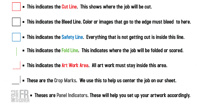
These templates will help you identify where the cut line, bleed line, and safety line, are located along with other information so you can design your art correctly.
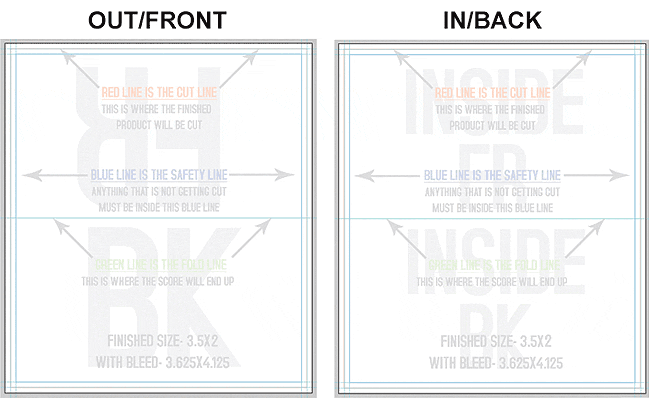
Some of our templates are labeled as OUT and IN. This means that there is some folding involved with the template. OUT means the FRONT of the job and IN means the BACK. During the upload part of your order, remember that OUT is the FRONT and IN is the BACK.
Here is what an 8.5x11tri-fold brochure template looks like:
Here is an example of the fold-over business card template: 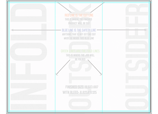
As you can see, OUT is the FRONT of the job and after folding, will be facing outward. You can also see the rotation of the job. The front must be positioned upside down so it can fold correctly.
Remember, do not move or change any part of the template when using them.